With a huge hat tip to Tanta, here is a video she posted years ago.
Hmmm ... "Top ramen tastes a lot better when you eat it off a granite counter top" ...
Friday, May 31, 2013
Bank Failure #14 in 2013: Banks of Wisconsin, Kenosha, Wisconsin
From the FDIC: North Shore Bank, FSB, Brookfield, Wisconsin, Assumes All of the Deposits of Banks of Wisconsin, Kenosha, Wisconsin
As of March 31, 2012, Banks of Wisconsin had approximately $134.0 million in total assets and $127.6 million in total deposits. ... The FDIC estimates that the cost to the Deposit Insurance Fund (DIF) will be $26.3 million. ... Banks of Wisconsin is the 14th FDIC-insured institution to fail in the nation this year, and the first in Wisconsin.The FDIC has slowed down on closing banks, but they are still on pace to close 30+ banks this year.
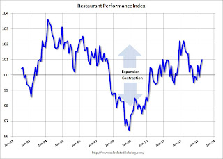
Restaurant Performance Index increases in April
From the National Restaurant Association: Restaurant Performance Index Hits 10-Month High as Operators’ Business Expectations Improve
 Click on graph for larger image.
The index increased to 101.0 in April from 100.6 in March. (above 100 indicates expansion).
Restaurant spending is discretionary, so even though this is "D-list" data, I like to check it every month.
Driven by higher same-store sales and an improving outlook among restaurant operators, the National Restaurant Association’s Restaurant Performance Index (RPI) hit a 10-month high in April. The RPI – a monthly composite index that tracks the health of and outlook for the U.S. restaurant industry – stood at 101.0 in April, up 0.4 percent from a level of 100.6 in March. In addition, April represented the third time in the last four months that the RPI topped the 100 level, which signifies expansion in the index of key industry indicators.
“Growth in the Restaurant Performance Index was due largely to restaurant operators’ healthier outlook for the business environment in the coming months,” said Hudson Riehle, senior vice president of the Research and Knowledge Group for the Association. “In particular, there was a dropoff in the proportion of operators who expect conditions to worsen in the months ahead, which suggests a broadening of the perspective that the expansion is firmly entrenched.”
...
The Current Situation Index, which measures current trends in four industry indicators (same-store sales, traffic, labor and capital expenditures), stood at 100.1 in April – up 0.3 percent from a level of 99.8 in March. April represented the first time in eight months that the Current Situation Index rose above 100, which signifies expansion in the current situation indicators.
 Click on graph for larger image.
The index increased to 101.0 in April from 100.6 in March. (above 100 indicates expansion).
Restaurant spending is discretionary, so even though this is "D-list" data, I like to check it every month.
Social Security and Medicare Trustees Report Released
Here is the summary of the 2013 Annual Report of the Board of Trustees of the Federal Old-Age and Survivors Insurance and Federal Disability Insurance Trust Funds. And a brief excerpt:
As the Columbia Journalism Review noted, any publication that says the fund is "bankrupt" or "on track for insolvency" gets an "F" for reporting (I've already seen a few).
What is the Outlook for Future Social Security and Medicare Costs in Relation to GDP? One instructive way to view the projected costs of Social Security and Medicare is to compare the costs of scheduled benefits for the two programs with the gross domestic product (GDP), the most frequently used measure of the total output of the U.S. economy (Chart A). Under the intermediate assumptions employed in the reports and throughout this Summary, costs for both programs increase substantially through 2035 when measured this way because: (1) the number of beneficiaries rises rapidly as the baby-boom generation retires; and (2) the lower birth rates that have persisted since the baby boom cause slower growth of the labor force and GDP. Social Security’s projected annual cost increases to about 6.2 percent of GDP by 2035, declines to 6.0 percent by 2050, and remains between 6.0 and 6.2 percent of GDP through 2087. Under current law, projected Medicare cost rises to 5.6 percent of GDP by 2035, largely due to the rapid growth in the number of beneficiaries, and then to 6.5 percent in 2087, with growth in health care cost per beneficiary becoming the larger factor later in the valuation period.The increase in Social Security as a percent of GDP has always been expected. The larger concern is the increase in Medicare. According to the report, the OASI trust fund will be depleted in 2035 (then the program will either run a deficit or a pay the portion received in payroll taxes). The current large trust fund was a result of payroll tax increases under President Reagan to have the baby boomers prepay their social security on the recommendation of the Greenspan commission. The eventual depletion of the trust fund was expected.
In 2012, the combined cost of the Social Security and Medicare programs equaled 8.7 percent of GDP. The Trustees project an increase to 11.8 percent of GDP in 2035 and 12.7 percent of GDP in 2087. Although Medicare cost (3.6 percent of GDP) is smaller than Social Security cost (5.0 percent of GDP) in 2012, the gap closes gradually until 2056, when Medicare is projected to be the more costly program. During the final decade of the long-range projection period, Medicare cost is modestly larger than Social Security cost.

As the Columbia Journalism Review noted, any publication that says the fund is "bankrupt" or "on track for insolvency" gets an "F" for reporting (I've already seen a few).
Final May Consumer Sentiment increases to 84.5, Chicago PMI increases sharply to 58.7

Click on graph for larger image.
• The final Reuters / University of Michigan consumer sentiment index for May increased to 84.5 from the April reading of 76.4, and up from the preliminary reading of 83.7. This is the highest level since July 2007.
This was above the consensus forecast of 83.7. Sentiment has generally been improving following the recession - with plenty of ups and downs - and one big spike down when Congress threatened to "not pay the bills" in 2011.
• From the Chicago ISM:
May 2013:
The Chicago Purchasing Managers reported April's Chicago Business Barometer sprung 9.7 to 58.7, the highest since March 2012 and in sharp contrast to April's 3-1/2 year low. All Business Activity measures surged in May, reversing weakness seen in most categories in March and April.PMI: Increased to 58.7 from 49.0. (Above 50 is expansion).
Employment increased to 56.9, up from 48.7.
New orders increased to 58.1 from 53.2.
This was well above the consensus estimate of 50.0.
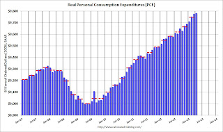
Personal Income declined slightly in April, Spending declined 0.2%
The BEA released the Personal Income and Outlays report for April:
 Click on graph for larger image.
This graph shows real PCE by month for the last few years. The dashed red lines are the quarterly levels for real PCE.
Some of the decline in spending is probably related to lower gasoline prices in April - and that is actually a positive (gasoline prices rebounded in May though). Also PCE was revised up for January (slightly), February and March.
A key point is that the PCE price index was only up 0.7% year-over-year (1.1% for core PCE). Core PCE increased at a 0.1% annualized rate in April keeping the pressure off the Fed to taper asset purchases.
Personal income decreased $5.6 billion, or less than 0.1 percent ... in April, according to the Bureau of Economic Analysis. Personal consumption expenditures (PCE) decreased $20.5 billion, or 0.2 percent. In March, personal income increased $36.2 billion, or 0.3 percent ... and PCE increased $14.2 billion, or 0.1 percent, based on revised estimates.The following graph shows real Personal Consumption Expenditures (PCE) through April (2005 dollars). Note that the y-axis doesn't start at zero to better show the change.
...
Real PCE -- PCE adjusted to remove price changes -- increased 0.1 percent in April, compared with an increase of 0.2 percent in March. ... The price index for PCE decreased 0.3 percent in April, compared with a decrease of 0.1 percent in March. The PCE price index, excluding food and energy, increased less than 0.1 percent, compared with an increase of 0.1 percent.
...
Personal saving -- DPI less personal outlays -- was $306.9 billion in April, compared with $301.4 billion in March. The personal saving rate -- personal saving as a percentage of disposable personal income -- was 2.5 percent in April, the same as in March.
 Click on graph for larger image.
This graph shows real PCE by month for the last few years. The dashed red lines are the quarterly levels for real PCE.
Some of the decline in spending is probably related to lower gasoline prices in April - and that is actually a positive (gasoline prices rebounded in May though). Also PCE was revised up for January (slightly), February and March.
A key point is that the PCE price index was only up 0.7% year-over-year (1.1% for core PCE). Core PCE increased at a 0.1% annualized rate in April keeping the pressure off the Fed to taper asset purchases.
The Middle Class Is On the Move All Over the World

The second purpose is to open Western eyes to the economic dynamism of BRIC countries and their emerging and developing market cohorts in Asia, Africa, the Middle East and Latin America. The Middle Class in on the move all over the world, and is moving at a faster pace in the Developing and Emerging global sector than in the Developed sector.Learn more over at Milton Kotler's China blog (fascinating material).
Photo courtesy: ©2013 Laurel Delaney. All rights reserved.
Thursday, May 30, 2013
Friday: April Personal Income and Outlays, 2013 Social Security Trustees Report
The 2013 Social Security Trustees Report is expected tomorrow. If it is released, expect some terrible media coverage. Last year, the Columbia Journalism Review issued a Report Card on Social Security Trust Fund Coverage. They gave the media an "F" on headlines, and a "C-" on coverage.
Friday economic releases:
• At 8:30 AM ET, the BEA will release the Personal Income and Outlays for April. The consensus is for a 0.1% increase in personal income in April, and for no change in personal spending. Also for the Core PCE price index to increase 0.1%. Based on the second estimate of GDP, there will be an upward revision to outlays for Q1.
• At 9:45 AM, the Chicago Purchasing Managers Index for May will be released. The consensus is for an increase to 50.0, up from 49.0 in April.
• At 9:55 AM, the Reuter's/University of Michigan's Consumer sentiment index (final for May). The consensus is for a reading of 83.7.
• Expected: The 2013 Annual Report of the Board of Trustees of the Federal Old-Age and Survivors Insurance and Federal Disability Insurance Trust Funds
With a few exceptions like USNews.com, the ABCNews blog, and Mark Miller, who noted on his Reuters blog “[Security Commissioner Michael] Astrue went out of his way to emphasize that the program is far from broke,” Astrue’s warning went unheeded.. Most press coverage ignored Astrue’s cautions and left the impression with the public that Social Security will not be there for them. “There won’t be much money left for you” after 2033, declared a reporter on WBEZ in Chicago.Obviously any site that says "broke" or "bankrupt", is well, wrong. Unfortunately the coverage is typically more political than data driven. Be prepared to ridicule the coverage (The Columbia article has some great examples from last year).
Friday economic releases:
• At 8:30 AM ET, the BEA will release the Personal Income and Outlays for April. The consensus is for a 0.1% increase in personal income in April, and for no change in personal spending. Also for the Core PCE price index to increase 0.1%. Based on the second estimate of GDP, there will be an upward revision to outlays for Q1.
• At 9:45 AM, the Chicago Purchasing Managers Index for May will be released. The consensus is for an increase to 50.0, up from 49.0 in April.
• At 9:55 AM, the Reuter's/University of Michigan's Consumer sentiment index (final for May). The consensus is for a reading of 83.7.
• Expected: The 2013 Annual Report of the Board of Trustees of the Federal Old-Age and Survivors Insurance and Federal Disability Insurance Trust Funds
Fake Prosperity in Ireland for the G8 Summit
Oh my ... from the Irish Times: Recession out of the picture as Fermanagh puts on a brave face for G8 leaders
Just a few weeks ago, Flanagan’s – a former butcher’s and vegetable shop in the neat village – was cleaned and repainted with bespoke images of a thriving business placed in the windows. Any G8 delegate passing on the way to discuss global capitalism would easily be fooled into thinking that all is well with the free-market system in Fermanagh. But, the facts are different. ...The picture in the Irish Times is amazing. Ahhh, a Potemkin village that might fool some "leaders" into thinking Ireland is actually recovering.
The butcher’s business has been replaced by a picture of a butcher’s business. Across the road is a similar tale. A small business premises has been made to look like an office supplies store. It used to be a pharmacy, now relocated on the village main street.
Elsewhere in Fermanagh, billboard-sized pictures of the gorgeous scenery have been located to mask the occasional stark and abandoned building site or other eyesore.
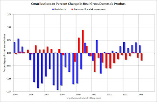
A few comments on 2nd Estimate of GDP
Earlier the BEA reported the second estimate of Q1 GDP. The revisions were fairly small, as the BEA reported that real GDP increased at a 2.4% annual rate in Q1, revised down from the advanced estimate of 2.5%. The underlying details were slightly positive.
Personal consumption expenditure (PCE) grew at a 3.4% annualized real rate in Q1, revised up from 3.2%.
The change in private inventories was revised down to a 0.63 percentage point contribution from a 1.03 percentage point contribution in the advance report (a 0.40 percentage point decline between estimates). This smaller buildup in inventories for Q1 is probably a positive for Q2.
A key negative was the contribution from state and local government from -0.14 percentage points to -0.29 percentage points - the largest drag since Q2 2011.
This graph shows the contribution to percent change in GDP for residential investment and state and local governments since 2005.
 Click on graph for larger image.
The blue bars are for residential investment (RI), and RI was a significant drag on GDP for several years - and is now adding to the economy.
However the drag from state and local governments has continued. Just ending this drag will be a positive for the economy. Note: In real terms, state and local government spending is at the lowest level since Q1 2001.
With consumer spending holding up, residential investment increasing - and state and local governments near the bottom - this suggests decent growth going forward. Of course there will be a substantial drag from Federal fiscal policy over the next couple of quarters ...
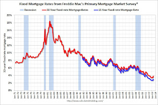
Freddie Mac: "Fixed Mortgage Rates Highest in a Year"
From Freddie Mac today: Fixed Mortgage Rates Highest in a Year
 Click on graph for larger image.
This graph shows the the 30 year and 15 year fixed rate mortgage interest rates from the Freddie Mac Primary Mortgage Market Survey®. Not much of an increase recently, but this is the highest level in a year.
This is a weekly average for the week ending May 30th. Rates moved higher over the last couple of days, and 30 year rates will probably be close to 4% in the next survey if Treasury yields remain at the current level.
Note: The Freddie Mac survey started in 1971 and rates were below 5% in earlier periods.
 The second graph shows the 30 year fixed rate mortgage interest rate from the Freddie Mac Primary Mortgage Market Survey® compared to the MBA refinance index.
The refinance index has dropped sharply recently (down almost 30% over the last 3 weeks) and will probably decline significantly if rates stay at this level.
Freddie Mac today released the results of its Primary Mortgage Market Survey® (PMMS®), showing fixed mortgage rates following long-term government bond yields higher. The average 30-year fixed moved up nearly half a percentage point since the beginning of May when it averaged 3.35 percent. ...
30-year fixed-rate mortgage (FRM) averaged 3.81 percent with an average 0.8 point for the week ending May 30, 2013, up from last week when it averaged 3.59 percent. Last year at this time, the 30-year FRM averaged 3.75 percent.
15-year FRM this week averaged 2.98 percent with an average 0.7 point, up from last week when it averaged 2.77 percent. A year ago at this time, the 15-year FRM averaged 2.97 percent.
 Click on graph for larger image.
This graph shows the the 30 year and 15 year fixed rate mortgage interest rates from the Freddie Mac Primary Mortgage Market Survey®. Not much of an increase recently, but this is the highest level in a year.
This is a weekly average for the week ending May 30th. Rates moved higher over the last couple of days, and 30 year rates will probably be close to 4% in the next survey if Treasury yields remain at the current level.
Note: The Freddie Mac survey started in 1971 and rates were below 5% in earlier periods.
 The second graph shows the 30 year fixed rate mortgage interest rate from the Freddie Mac Primary Mortgage Market Survey® compared to the MBA refinance index.
 The refinance index has dropped sharply recently (down almost 30% over the last 3 weeks) and will probably decline significantly if rates stay at this level.
NAR: Pending Home Sales index increases slightly in April
From the NAR: Pending Home Sales Edge Up in April
With limited inventory at the low end and fewer foreclosures, we might see flat or even declining existing home sales. The key is that the number of conventional sales is increasing while foreclosures and short sales decline - and that is a sign of an improving market (although with significant investor buying), even if total sales decline.
The Pending Home Sales Index, a forward-looking indicator based on contract signings, rose 0.3 percent to 106.0 in April from 105.7 in March, and is 10.3 percent above April 2012 when it was 96.1; the data reflect contracts but not closings.Contract signings usually lead sales by about 45 to 60 days, so this would usually be for closed sales in May and June.
Home contract activity is at the highest level since the index hit 110.9 in April 2010, immediately before the deadline for the home buyer tax credit. Pending sales have been above year-ago levels for the past 24 months.
...
The PHSI in the Northeast jumped 11.5 percent to 92.3 in April and is 17.7 percent above a year ago. In the Midwest the index rose 3.2 percent to 107.1 in April and is 15.1 percent higher than April 2012. Pending home sales in the South slipped 1.1 percent to an index of 119.2 in April but are 12.3 percent above a year ago. With pronounced inventory constraints, the index in the West fell 7.6 percent in April to 94.6 and is 2.6 percent below April 2012.
With limited inventory at the low end and fewer foreclosures, we might see flat or even declining existing home sales. The key is that the number of conventional sales is increasing while foreclosures and short sales decline - and that is a sign of an improving market (although with significant investor buying), even if total sales decline.
Weekly Initial Unemployment Claims increase to 354,000
Note: The BEA reported GDP for Q1 was revised down to a 2.4% annualized real growth rate from 2.5% in the advance report:
The DOL reports:
The following graph shows the 4-week moving average of weekly claims since January 2000.
 Click on graph for larger image.
The dashed line on the graph is the current 4-week average. The four-week average of weekly unemployment claims increased to 347,250.
Claims were above the 340,000 consensus forecast.
Real gross domestic product -- the output of goods and services produced by labor and property located in the United States -- increased at an annual rate of 2.4 percent in the first quarter of 2013 (that is, from the fourth quarter to the first quarter), according to the "second" estimate released by the Bureau of Economic Analysis. ... The GDP estimate released today is based on more complete source data than were available for the "advance" estimate issued last month. In the advance estimate, real GDP increased 2.5 percent. With the second estimate for the first quarter, increases in private inventory investment, in exports, and in imports were less than previously estimated, but the general picture of overall economic activity is not greatly changed.I'll have more on GDP later.
The DOL reports:
In the week ending May 25, the advance figure for seasonally adjusted initial claims was 354,000, an increase of 10,000 from the previous week's revised figure of 344,000. The 4-week moving average was 347,250, an increase of 6,750 from the previous week's revised average of 340,500.The previous week was revised up from 340,000.
The following graph shows the 4-week moving average of weekly claims since January 2000.
 Click on graph for larger image.
The dashed line on the graph is the current 4-week average. The four-week average of weekly unemployment claims increased to 347,250.
Claims were above the 340,000 consensus forecast.
3 Lessons To Learn About Unifying, Localizing and Laying a Foundation for Global Growth
 |
| iStockphoto/Thinkstock |
One CIO's point of view:
Read: 3 CIO Strategies for Going GlobalBuild a Platform for Growth
Peter Weis, VP and CIO, Matson: For more than 120 years, Matson focused primarily on the Hawaiian market. Nearly 10 years ago, we expanded internationally into China, and we knew then that our IT strategy needed to enable global expansion. We've embedded globalization into all four components of our IT strategy: applications, organization, architecture and governance.
Wednesday, May 29, 2013
Thursday: Q1 GDP, Initial Unemployment Claims
Tim Duy thinks the Fed might start to taper asset purchases in September: September Looking Good
Of course "tapering" is still very accommodative.
Thursday economic releases:
• At 7:00 AM ET, the BEA will release the second estimate of Q1 GDP. The consensus is that real GDP increased 2.5% annualized in Q1, unchanged from the advance report.
• Also at 8:30 AM, the initial weekly unemployment claims report will be released. The consensus is for claims at 340 thousand, unchanged from last week.
• At 10:00 AM, the NAR will release Pending Home Sales Index for April. The consensus is for a 1.4% increase in the index
A "few more months" I interpret as June, July, and August, which puts the beginning of tapering at the September FOMC meeting. I think that Fed speakers are sending pretty clear signals to prepare for a September policy change.Most analysts expect some economic slowdown in Q2 and Q3 due to the significant fiscal drag over the next couple of quarters. I expect the Fed will wait and see how much fiscal policy impacts growth and employment, so - unless the data is very strong - I think the Fed will wait until at least September before they start tapering.
Some big names on Wall Street don't agree. Vincent Reinhart at Morgan Stanley believes the data will push the Fed back to December. The view at Goldman Sachs is reportedly similar. To be sure, the data might cut in that direction, but I think that the bar to tapering might be lower than believed by those looking for a shift in December. We may believe the Federal Reserve's dual mandate argues for a longer period of QE at its current pace, but I am thinking that for the Federal Reserve, the dual mandate has more to do with the lift-off date from ZIRP than the end of QE. They have tended to argue for more or less QE on the basis of "stronger and sustainable" improvement in labor markets, and, given the obvious shift in tone among Fed speakers, I think we have reached that benchmark. At this point, they are just looking for a little more confirmation, in their minds erring on the side of being "too easy."
A lot of data will be coming in the door over the next week and a half, culminating in the all-important employment report on Friday, June 5. I think even a moderately positive run of data will further cement a September shift.
Of course "tapering" is still very accommodative.
Thursday economic releases:
• At 7:00 AM ET, the BEA will release the second estimate of Q1 GDP. The consensus is that real GDP increased 2.5% annualized in Q1, unchanged from the advance report.
• Also at 8:30 AM, the initial weekly unemployment claims report will be released. The consensus is for claims at 340 thousand, unchanged from last week.
• At 10:00 AM, the NAR will release Pending Home Sales Index for April. The consensus is for a 1.4% increase in the index
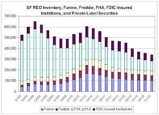
Lawler: Single Family REO Inventory Continued to Decline in Q1; Down 24% from Year Ago, 39% from Two Years Ago
From economist Tom Lawler:
The FDIC released its Quarterly Banking Profile for the first quarter of 2013, and according to the report the carrying value of 1-4 family residential real estate owned (REO) by FDIC-insured institutions at the end of March was $7.89 billion, down from $8.34 billion at the end of December, and down from $11.08 billion at the end of March 2012.
Assuming that the average carrying value of SF REO at FDIC-insured institutions is 50% higher than the average for Fannie Mae and Freddie Mac, here is a chart showing quarterly SF REO inventories at Fannie, Freddie, FHA, FDIC-insured institutions and private-label securities. (The source of my PLS data only had data through the end of February, which I used for Q1/2013).
 Click on graph for larger image.
SF REO inventories at these entities totaled an estimated 341,439 at the end of March, down 24% from last March, down 39% from March 2011, and down 47% from September 2008.
Housing Report: Institutional Investor Stops Buying, blames "stupid money"
From John Gittelsohn at Bloomberg: Carrington Stops Buying U.S. Rentals as Blackstone Adding (ht Soylent Green Is People)
Early last year I checked back with these small investors, and they had all stopped buying. The numbers no longer made sense with all the large institutional buyers. Now it appears the numbers no longer make sense for at least one large buyer.
“We just don’t see the returns there that are adequate to incentivize us to continue to invest,” [Bruce] Rose, 55, chief executive officer of Carrington Holding Co. LLC, said in an interview at his Aliso Viejo, California office. “There’s a lot of -- bluntly -- stupid money that jumped into the trade without any infrastructure, without any real capabilities and a kind of build-it-as-you-go mentality that we think is somewhat irresponsible.”Back in late 2008 and early 2009, I started reporting on small investor groups buying low end single family properties to rent. Since then rents have increased sharply and vacancy rates fallen.
...
Carrington, which started in 2003 as a mortgage investment fund and has managed almost 25,000 rental homes for itself and others, has been joined by hundreds of institutional and international investors buying single-family homes after prices plunged following the housing crash.
...
Blackstone Group LP (BX), the largest investor in single-family rentals, has spent $4.5 billion to amass more than 26,000 homes and continues to buy, according to Eric Elder, a spokesman for Invitation Homes, the rental housing division of the world’s largest private equity firm. ... Blackstone’s net yields on its occupied houses are about 6 percent to 6.5 percent ...
Early last year I checked back with these small investors, and they had all stopped buying. The numbers no longer made sense with all the large institutional buyers. Now it appears the numbers no longer make sense for at least one large buyer.
Reports: Small Business Credit Improving
From J.D. Harrison at the WaPo: Small business lending freeze starting to thaw
The credit health of small companies across the country improved during the first quarter of 2013, according to a new report by Experian and Moody’s Analytics ... Sageworks, a financial information firm, released its latest private company report earlier this week, which shows that the average risk of business loan default has dropped to 4.1 percent from 5.1 percent last April.Small businesses have been slow to recover, partially because so many small businesses are real estate and retail related. Improving credit is a positive sign and might lead to more small business hiring.
...
“The improvement in default rates coupled with healthy sales and profitability show that private companies may be well positioned to borrow,” said Sageworks Chairman Brian Hamilton.
The small business lending Index from Direct Capital, which provides equipment leasing and business loans, backs up that claim, showing that small business borrowing demand ticked higher nationwide for the fourth straight month in April. Over that period, the number of small business owners seeking loans has surged 44 percent compared to the first four months of 2012.
But are they actually finding the capital they need? More and more of them, yes, according to online lending platform Biz2Credit’s monthly survey.
The report showed the nation’s largest banks approved 16.8 percent of small business loans in April, up from 15.7 percent in March and 10.6 percent in April 2012.
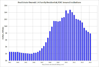
FDIC reports Record Earnings for insured institutions, Fewer Problem banks, Residential REO Declines in Q1
The FDIC released the Quarterly Banking Profile for Q1 today.
 Click on graph for larger image.
The dollar value of 1-4 family residential Real Estate Owned (REOs, foreclosure houses) declined from $8.34 billion in Q4 2012 to $7.89 billion in Q1. This is the lowest level of REOs since Q4 2007. Even in good times, the FDIC insured institutions have about $2.5 billion in residential REO.
This graph shows the dollar value of Residential REO for FDIC insured institutions. Note: The FDIC reports the dollar value and not the total number of REOs.
Improvements in noninterest income and expense, plus broad-based reductions in loan loss provisions, outweighed declining net interest income and helped lift industry earnings to an all-time high of $40.3 billion in first quarter 2013. First-quarter net income was $5.5 billion (15.8 percent) higher than in first quarter 2012, as a reduction in expenses for litigation costs and proceeds from a legal settlement boosted reported earnings. Half of all insured institutions reported year-over-year improvement in quarterly earnings, the lowest proportion since fourth quarter 2009.The FDIC reported the number of problem banks declined:
The number of FDIC-insured institutions reporting financial results fell to 7,019 in the first quarter, down from 7,083 in fourth quarter 2012. Mergers absorbed 55 institutions during the quarter, and four institutions failed. This is the smallest number of failures in a quarter since second quarter 2008. For a 7th consecutive quarter, no new insured institutions were added. Except for charters created to absorb failed banks, there have been no new charters added since fourth quarter 2010. The number of insured institutions on the FDIC’s “Problem List” declined for an eighth consecutive quarter, from 651 to 612. Total assets of “problem” institutions declined from $233 billion to $213 billion. The number of full-time equivalent employees at insured institutions fell from 2,110,276 to 2,102,839 during the quarter.
 Click on graph for larger image.
The dollar value of 1-4 family residential Real Estate Owned (REOs, foreclosure houses) declined from $8.34 billion in Q4 2012 to $7.89 billion in Q1. This is the lowest level of REOs since Q4 2007. Even in good times, the FDIC insured institutions have about $2.5 billion in residential REO.
This graph shows the dollar value of Residential REO for FDIC insured institutions. Note: The FDIC reports the dollar value and not the total number of REOs.
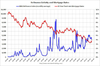
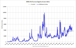
MBA: Mortgage Purchase Applications increase, Refinance Applications decline sharply in latest survey
From the MBA: Mortgage Applications Decrease in Latest MBA Weekly Survey
 Click on graph for larger image.
The first graph shows the refinance index.
There has been a sustained refinance boom for over a year.
However the index is down almost 30% over the last three weeks, and this is the lowest level since last December.
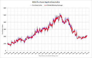 The second graph shows the MBA mortgage purchase index. The 4-week average of the purchase index has generally been trending up over the last year, and the 4-week average of the purchase index is up about 10% from a year ago.
The Refinance Index decreased 12 percent, the largest single week drop in refinance applications this year, from the previous week to the lowest level since December 2012. The seasonally adjusted Purchase Index increased 3 percent from one week earlier.
...
"Refinance applications fell for the third straight week bringing the refinance index to its lowest level since December 2012 as mortgage rates increased to their highest level in a year,” said Mike Fratantoni, MBA’s Vice President of Research and Economics. “Rates rose in response to stronger economic data and an increasing chance that the Fed may soon begin to taper their asset purchases."
The average contract interest rate for 30-year fixed-rate mortgages with conforming loan balances ($417,500 or less) increased to 3.90 percent, the highest rate since May 2012, from 3.78 percent, with points unchanged at 0.39 (including the origination fee) for 80 percent loan-to-value ratio (LTV) loans.
emphasis added
 Click on graph for larger image.
The first graph shows the refinance index.
There has been a sustained refinance boom for over a year.
However the index is down almost 30% over the last three weeks, and this is the lowest level since last December.
 The second graph shows the MBA mortgage purchase index. The 4-week average of the purchase index has generally been trending up over the last year, and the 4-week average of the purchase index is up about 10% from a year ago.
Global-First
 |
| iStockphoto/Thinkstock |
So your back of the napkin strategy would look like this for your new business:
1. Go global first.
2. Go domestic (local) later.
It's that's simple. Read the entire article: How To Go Global and Win Big With your Startup
Lead paragraph to article:
The US is a global leader in Internet and smartphone penetration and use, but the rest of the world is catching up fast. With a good part of the growth for consumer products happening abroad, the question isn’t if you should go global with your startup, but how and when.Related post (1/30/13): Startups Going Global
Tuesday, May 28, 2013
Wednesday: FDIC Quarterly Banking Profile
Earlier on house prices:
• Case-Shiller: Comp 20 House Prices increased 10.9% year-over-year in March
• Real House Prices, Price-to-Rent Ratio, City Prices relative to 2000
And from Nick Timiraos at the WSJ about concerns of a new bubble: Home Sales Power Optimism
• At 7:00 AM ET, Update: Because of the holiday, this will probably be released on Thursday. the Mortgage Bankers Association (MBA) will release the results for the mortgage purchase applications index. Look for rising mortgage rates.
• At 10:00 AM, the FDIC will release the Q1 Quarterly Banking Profile and hold "a press conference to discuss a comprehensive summary of the first quarter 2013 financial results for all FDIC-insured institutions". The webcast of the press conference will be available here.
• Case-Shiller: Comp 20 House Prices increased 10.9% year-over-year in March
• Real House Prices, Price-to-Rent Ratio, City Prices relative to 2000
And from Nick Timiraos at the WSJ about concerns of a new bubble: Home Sales Power Optimism
The pace of home-price gains has raised concerns among some economists over whether low mortgage rates have stimulated unsustainable home-price inflation—the proverbial bubble that some critics of Fed policies have feared. ...And from Catherine Rampell at the NY Times: Homes See Biggest Price Gain in Years, Propelling Stocks
The worries about rapid price growth look especially founded in more expensive markets such as San Francisco, Los Angeles and San Diego that have witnessed double-digit price gains over the past year. While home prices still look cheap on a historical basis, "the trouble is that that impression is almost entirely the function of low mortgage rates," said Stan Humphries, chief economist at Zillow Inc. Cheap credit is "distorting housing considerably," he said.
Others say it's too soon for alarm. Price gains largely reflect a rebound from low levels and prices remain largely in line with their long-run relationship between incomes and rents, said Christopher Thornberg, an economist with Beacon Economics in Los Angeles. "Could this thing go on too long? Absolutely," he said. "Could it turn into the next bubble? Absolutely. But we're not there yet, so I'm not going to start screaming 'Bubble.' "
Economists generally expect home prices to continue rising, particularly as the economy improves and more young people move out of their parents’ homes and into homes of their own. And many dismiss concerns of a potential bubble, not only because household formation is growing but also because housing prices remain well below their highs. Even after 10 straight months of year-over-year gains, the 20-city Case-Shiller composite price index is 28 percent below its previous peak in July 2006, which is probably a good thing.Wednesday economic releases:
“Talk of a house price bubble seems premature,” said Ed Stansfield, an economist at Capital Economics. “In relation to incomes, rents or their own past, U.S. home prices still look low.”
What’s more, credit is still hard to come by. The Federal Reserve has pushed interest rates down about as far as they can go, but many people who want to buy are still finding it difficult to get a home loan.
“We usually think of bubbles as being driven by extremely easy credit, with people borrowing more than the outstanding value of the house and making little to no down payment,” said Mr. Gapen. “That’s not the case with credit standards today.”
• At 7:00 AM ET, Update: Because of the holiday, this will probably be released on Thursday. the Mortgage Bankers Association (MBA) will release the results for the mortgage purchase applications index. Look for rising mortgage rates.
• At 10:00 AM, the FDIC will release the Q1 Quarterly Banking Profile and hold "a press conference to discuss a comprehensive summary of the first quarter 2013 financial results for all FDIC-insured institutions". The webcast of the press conference will be available here.
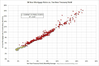
4% 30 Year Mortgage Rates?
From Zillow today: 30-Year Fixed Mortgage Rates Rise to 12-Month Highs; Current Rate is 3.71%
 Click on graph for larger image.
Currently the 10 year Treasury yield is 2.135% and 30 year mortgage rates are at 3.71% (according to Zillow). Based on the relationship from the graph, if the ten year yield stays in this range, 30 year mortgage rates might move up to around 4%.
Note: The yellow markers are for the last three years with the ten year yield below 3%. A trend line through the yellow markers only is a little lower, but still close to 4% at the current 10 year Treasury yield.
Mortgage rates for 30-year fixed mortgages rose this week, with the current rate borrowers were quoted on Zillow Mortgage Marketplace at 3.71 percent, up from 3.58 percent at this same time last week.Here is an update to an old graph - by request - that shows the relationship between the monthly 10 year Treasury Yield and 30 year mortgage rates from the Freddie Mac survey.
The 30-year fixed mortgage rate hovered between 3.65 and 3.68 percent for the majority of the week before rising to the current rate this morning.
“Rates spiked last week after meeting minutes revealed the Fed was contemplating scaling back economic stimulus plans much earlier than expected,” said Erin Lantz, director of Zillow Mortgage Marketplace. “Now at 12-month highs, we expect rates to remain stable in the near-term, but new direction from the Fed and employment figures could boost rates significantly.”
 Click on graph for larger image.
Currently the 10 year Treasury yield is 2.135% and 30 year mortgage rates are at 3.71% (according to Zillow). Based on the relationship from the graph, if the ten year yield stays in this range, 30 year mortgage rates might move up to around 4%.
Note: The yellow markers are for the last three years with the ten year yield below 3%. A trend line through the yellow markers only is a little lower, but still close to 4% at the current 10 year Treasury yield.
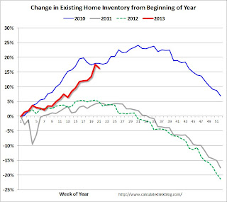
Existing Home Inventory is up 16.4% year-to-date on May 27th
Weekly Update: One of key questions for 2013 is Will Housing inventory bottom this year?. Since this is a very important question, I'm tracking inventory weekly in 2013.
There is a clear seasonal pattern for inventory, with the low point for inventory in late December or early January, and then peaking in mid-to-late summer.
The Realtor (NAR) data is monthly and released with a lag (the most recent data was for April). However Ben at Housing Tracker (Department of Numbers) has provided me some weekly inventory data for the last several years. This is displayed on the graph below as a percentage change from the first week of the year (to normalize the data).
In 2010 (blue), inventory increased more than the normal seasonal pattern, and finished the year up 7%. However in 2011 and 2012, there was only a small increase in inventory early in the year, followed by a sharp decline for the rest of the year.
 Click on graph for larger image.
Note: the data is a little weird for early 2011 (spikes down briefly).
So far in 2013, inventory is up 16.4%. This is well above the peak percentage increases for 2011 and 2012 and suggests to me that inventory is near the bottom. It now seems likely - at least by this measure - that inventory bottomed early this year (it could still happen early next year).
It is important to remember that inventory is still very low, and is down 15.5% from the same week last year according to Housing Tracker. Once inventory starts to increase (more than seasonal), buyer urgency will wane, and I expect price increases to slow.
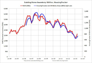 This graph shows the NAR estimate of existing home inventory through April (left axis) and the HousingTracker data for the 54 metro areas through late May.
Since the NAR released their revisions for sales and inventory in 2011, the NAR and HousingTracker inventory numbers have tracked pretty well.
The third graph shows the year-over-year change in inventory for both the NAR and HousingTracker.
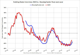 The year-over-year declines will probably continue to get smaller all year.
Right now I think inventory bottomed early this year, and, if correct, the year-over-year change will be zero late this year (or early in 2014).
There is a clear seasonal pattern for inventory, with the low point for inventory in late December or early January, and then peaking in mid-to-late summer.
The Realtor (NAR) data is monthly and released with a lag (the most recent data was for April). However Ben at Housing Tracker (Department of Numbers) has provided me some weekly inventory data for the last several years. This is displayed on the graph below as a percentage change from the first week of the year (to normalize the data).
In 2010 (blue), inventory increased more than the normal seasonal pattern, and finished the year up 7%. However in 2011 and 2012, there was only a small increase in inventory early in the year, followed by a sharp decline for the rest of the year.
 Click on graph for larger image.
Note: the data is a little weird for early 2011 (spikes down briefly).
So far in 2013, inventory is up 16.4%. This is well above the peak percentage increases for 2011 and 2012 and suggests to me that inventory is near the bottom. It now seems likely - at least by this measure - that inventory bottomed early this year (it could still happen early next year).
It is important to remember that inventory is still very low, and is down 15.5% from the same week last year according to Housing Tracker. Once inventory starts to increase (more than seasonal), buyer urgency will wane, and I expect price increases to slow.
 This graph shows the NAR estimate of existing home inventory through April (left axis) and the HousingTracker data for the 54 metro areas through late May.
 Since the NAR released their revisions for sales and inventory in 2011, the NAR and HousingTracker inventory numbers have tracked pretty well.
The third graph shows the year-over-year change in inventory for both the NAR and HousingTracker.
 The year-over-year declines will probably continue to get smaller all year.
Right now I think inventory bottomed early this year, and, if correct, the year-over-year change will be zero late this year (or early in 2014).
Real House Prices, Price-to-Rent Ratio, City Prices relative to 2000
Case-Shiller, CoreLogic and others report nominal house prices, and it is also useful to look at house prices in real terms (adjusted for inflation) and as a price-to-rent ratio.
As an example, if a house price was $200,000 in January 2000, the price would be close to $275,000 today adjusted for inflation. This is why economists also look at real house prices (inflation adjusted).
Note: If were I "wishcasting" as opposed to "forecasting", I'd like to see real house prices mostly move sideways for a few years. But given the low level of inventory, pent up demand, significant investor buying, and some bounce off the bottom in certain areas - real prices have been increasing fairly rapidly over the last year. I expect more inventory to come on the market and for price increases to slow.
Earlier: Case-Shiller: Comp 20 House Prices increased 10.9% year-over-year in March
Nominal House Prices
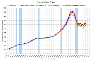 The first graph shows the quarterly Case-Shiller National Index SA (through Q1 2013), and the monthly Case-Shiller Composite 20 SA and CoreLogic House Price Indexes (through March) in nominal terms as reported.
In nominal terms, the Case-Shiller National index (SA) is back to Q3 2003 levels (and also back up to Q4 2008), and the Case-Shiller Composite 20 Index (SA) is back to December 2003 levels, and the CoreLogic index (NSA) is back to February 2004.
Real House Prices
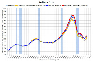 The second graph shows the same three indexes in real terms (adjusted for inflation using CPI less Shelter). Note: some people use other inflation measures to adjust for real prices.
In real terms, the National index is back to Q2 2000 levels, the Composite 20 index is back to March 2001, and the CoreLogic index back to March 2001.
In real terms, house prices are back to early '00s levels.
Price-to-Rent
In October 2004, Fed economist John Krainer and researcher Chishen Wei wrote a Fed letter on price to rent ratios: House Prices and Fundamental Value. Kainer and Wei presented a price-to-rent ratio using the OFHEO house price index and the Owners' Equivalent Rent (OER) from the BLS.
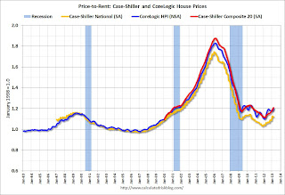 Here is a similar graph using the Case-Shiller National, Composite 20 and CoreLogic House Price Indexes.
This graph shows the price to rent ratio (January 1998 = 1.0).
On a price-to-rent basis, the Case-Shiller National index is back to Q2 2000 levels, the Composite 20 index is back to February 2001 levels, and the CoreLogic index is back to March 2001.
In real terms - and as a price-to-rent ratio - prices are mostly back to early 2000 levels.
Nominal Prices: Cities relative to Jan 2000
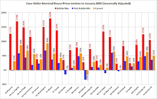 The last graph shows the bubble peak, the post bubble minimum, and current nominal prices relative to January 2000 prices for all the Case-Shiller cities in nominal terms.
As an example, at the peak, prices in Phoenix were 127% above the January 2000 level. Then prices in Phoenix fell slightly below the January 2000 level, and are now up 32% above January 2000. Some cities - like Denver and Dallas - are close to the peak level. Detroit prices are still below the January 2000 level.
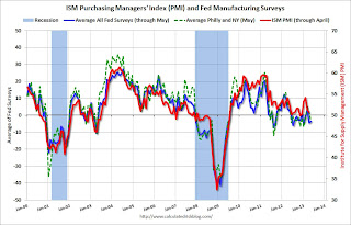
Dallas and Richmond Fed: Regional Manufacturing Activity mixed in May
These are the last two regional manufacturing surveys for May. From the Richmond Fed: Manufacturing Activity Declined At A Slightly Slower Rate In May; Expectations Improved
 Click on graph for larger image.
The New York and Philly Fed surveys are averaged together (dashed green, through May), and five Fed surveys are averaged (blue, through May) including New York, Philly, Richmond, Dallas and Kansas City. The Institute for Supply Management (ISM) PMI (red) is through April (right axis).
The ISM index for May will be released Monday, June 3rd, and these surveys suggest another weak reading, possibly even at or below 50 (contraction).
Manufacturing activity in the central Atlantic region contracted at a less pronounced rate in May after pulling back in April, according to the Richmond Fed’s latest survey. ...And from the Dallas Fed: Texas Manufacturing Activity Expands
In May, the seasonally adjusted composite index of manufacturing activity — our broadest measure of manufacturing — gained four points settling at −2 from April's reading of −6. Among the index's components, shipments recouped seventeen points to 8, the gauge for new orders slipped two points to finish at −10, and the jobs index subtracted six points to end at −3.
Texas factory activity increased sharply in May, according to business executives responding to the Texas Manufacturing Outlook Survey. The production index, a key measure of state manufacturing conditions, rose from -0.5 to 11.2, indicating a notable pickup in output.Here is a graph comparing the regional Fed surveys and the ISM manufacturing index:
Stronger manufacturing activity was reflected in other survey measures as well. The new orders index rebounded to 6.2 after falling to -4.9 in April. Similarly, the shipments index bounced back to 3.1 after dipping to -0.4. The capacity utilization index came in at 6.4, up from 2.7 last month.
Perceptions of broader business conditions continued to worsen in May. The general business activity index remained negative but moved up five points to -10.5. The company outlook index declined from -2.2 to -6.8, reaching its lowest level since July 2010.
Labor market indicators reflected weaker labor demand. The employment index fell to -6.3 in May, registering its first negative reading this year and reaching its lowest level since November 2009.
emphasis added
 Click on graph for larger image.
The New York and Philly Fed surveys are averaged together (dashed green, through May), and five Fed surveys are averaged (blue, through May) including New York, Philly, Richmond, Dallas and Kansas City. The Institute for Supply Management (ISM) PMI (red) is through April (right axis).
The ISM index for May will be released Monday, June 3rd, and these surveys suggest another weak reading, possibly even at or below 50 (contraction).
Case-Shiller: Comp 20 House Prices increased 10.9% year-over-year in March
S&P/Case-Shiller released the monthly Home Price Indices for March ("March" is a 3 month average of January, February and March prices).
This release includes prices for 20 individual cities, two composite indices (for 10 cities and 20 cities) and the Q1 national index.
Note: Case-Shiller reports Not Seasonally Adjusted (NSA), I use the SA data for the graphs.
From S&P: Home Prices See Strong Gains in the First Quarter of 2013 According to the S&P/Case-Shiller Home Price Indices
 Click on graph for larger image.
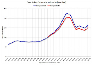
The first graph shows the nominal seasonally adjusted Composite 10 and Composite 20 indices (the Composite 20 was started in January 2000).
The Composite 10 index is off 27.3 % from the peak, and up 1.5% in March (SA). The Composite 10 is up 10.3% from the post bubble low set in Jan 2012 (SA).
The Composite 20 index is off 26.6% from the peak, and up 1.3% (SA) in March. The Composite 20 is up 10.9% from the post-bubble low set in Jan 2012 (SA).
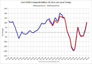 The second graph shows the Year over year change in both indices.
The Composite 10 SA is up 10.2% compared to March 2012.
The Composite 20 SA is up 10.9% compared to March 2012. This was the tenth consecutive month with a year-over-year gain and this was the largest year-over-year gain for the Composite 20 index since 2006.
Prices increased (SA) in 20 of the 20 Case-Shiller cities in March seasonally adjusted. Prices in Las Vegas are off 53.6% from the peak, and prices in Denver only off 0.1% from the peak.
This was above the consensus forecast for a 10.2% YoY increase. I'll have more on prices later.
This release includes prices for 20 individual cities, two composite indices (for 10 cities and 20 cities) and the Q1 national index.
Note: Case-Shiller reports Not Seasonally Adjusted (NSA), I use the SA data for the graphs.
From S&P: Home Prices See Strong Gains in the First Quarter of 2013 According to the S&P/Case-Shiller Home Price Indices
Data through March 2013, released today by S&P Dow Jones Indices for its S&P/Case-Shiller Home Price Indices ... showed that all three composites posted double-digit annual increases. The 10-City and 20-City Composites increased by 10.3% and 10.9% in the year to March with the national composite rising by 10.2% in the last four quarters. All 20 cities posted positive year-over-year growth.
In the first quarter of 2013, the national composite rose by 1.2%. On a monthly basis, the 10- and 20-City Composites both posted increases of 1.4%. Charlotte, Los Angeles, Portland, Seattle and Tampa were the five MSAs to record their largest month-over-month gains in over seven years.
“Home prices continued to climb,” says David M. Blitzer, Chairman of the Index Committee at S&P Dow Jones Indices. “Home prices in all 20 cities posted annual gains for the third month in a row. Twelve of the 20 saw prices rise at double-digit annual growth. The National Index and the 10- and 20-City Composites posted their highest annual returns since 2006.
“Phoenix again had the largest annual increase at 22.5% followed by San Francisco with 22.2% and Las Vegas with 20.6%. Miami and Tampa, the eastern end of the Sunbelt, were softer with annual gains of 10.7% and 11.8%. The weakest annual price gains were seen in New York (+2.6%), Cleveland (+4.8%) and Boston (+6.7%); even these numbers are quite substantial.
 Click on graph for larger image.
 The first graph shows the nominal seasonally adjusted Composite 10 and Composite 20 indices (the Composite 20 was started in January 2000).
The Composite 10 index is off 27.3 % from the peak, and up 1.5% in March (SA). The Composite 10 is up 10.3% from the post bubble low set in Jan 2012 (SA).
The Composite 20 index is off 26.6% from the peak, and up 1.3% (SA) in March. The Composite 20 is up 10.9% from the post-bubble low set in Jan 2012 (SA).
 The second graph shows the Year over year change in both indices.
The Composite 10 SA is up 10.2% compared to March 2012.
The Composite 20 SA is up 10.9% compared to March 2012. This was the tenth consecutive month with a year-over-year gain and this was the largest year-over-year gain for the Composite 20 index since 2006.
Prices increased (SA) in 20 of the 20 Case-Shiller cities in March seasonally adjusted. Prices in Las Vegas are off 53.6% from the peak, and prices in Denver only off 0.1% from the peak.
This was above the consensus forecast for a 10.2% YoY increase. I'll have more on prices later.
LPS: House Price Index increased 1.4% in March, Up 7.6% year-over-year
Notes: I follow several house price indexes (Case-Shiller, CoreLogic, LPS, Zillow, FNC and more). The timing of different house prices indexes can be a little confusing. LPS uses March closings only (not a three month average like Case-Shiller or a weighted average like CoreLogic), excludes short sales and REOs, and is not seasonally adjusted.
From LPS: U.S. Home Prices Up 1.4 Percent for the Month; Up 7.6 Percent Year-Over-Year
Note: Case-Shiller for March will be released this morning.
From LPS: U.S. Home Prices Up 1.4 Percent for the Month; Up 7.6 Percent Year-Over-Year
Lender Processing Services ... today released its latest LPS Home Price Index (HPI) report, based on March 2013 residential real estate transactions. The LPS HPI combines the company’s extensive property and loan-level databases to produce a repeat sales analysis of home prices as of their transaction dates every month for each of more than 15,500 U.S. ZIP codes. The LPS HPI represents the price of non-distressed sales by taking into account price discounts for REO and short sales.The LPS HPI is off 19.5% from the peak in June 2006. Note: The press release has data for the 20 largest states, and 40 MSAs. LPS shows prices off 49.0% from the peak in Las Vegas, 37.3% off from the peak in Riverside-San Bernardino, CA (Inland Empire), and at a new peak in Austin, Dallas and Denver! (Also a new peak for the state of Texas).
Note: Case-Shiller for March will be released this morning.
Is Winning Strategy to Always Go Global?
 |
| iStockphoto/Thinkstock |
What do you think?
Related posts:
- New Barnes and Noble e-Reader May 24th
- Barnes & Noble to Go International
- Barnes and Noble NOOK Bookstore Will be Available in 10 International Markets by June 2013
- Barnes and Noble Nook Tips for International Users
- Barnes and Noble: Taking the Nook to Foreign Markets
- Pearson Completes Investment in Barnes and Noble Nook Media
- Who Has the Edge On Wireless Reading Devices?
Monday, May 27, 2013
Tuesday: Case-Shiller House Prices
From the WSJ: Lower Commodities Prices Provide Tailwind
Tuesday economic releases:
• At 9:00 AM ET, S&P/Case-Shiller House Price Index for March. Although this is the March report, it is really a 3 month average of January, February and March. The consensus is for a 10.2% year-over-year increase in the Composite 20 index (NSA) for December. The Zillow forecast is for the Composite 20 to increase 9.8% year-over-year, and for prices to increase 0.9% month-to-month seasonally adjusted.
• At 10:00 AM, the Richmond Fed Survey of Manufacturing Activity for May. The consensus is for a a reading of minus 3 for this survey, up from minus 6 in April (Below zero is contraction).
• Also at 10:00 AM, the Conference Board's consumer confidence index for May. The consensus is for the index to increase to 71.5 from 68.1.
• At 10:30 AM, the Dallas Fed Manufacturing Survey for May. This is the last of regional surveys for May. The consensus is a reading of minus 8, up from minus 15 in April (below zero is contraction).
Weekend:
• Schedule for Week of May 26th
• Public and Private Sector Payroll Jobs: Reagan, Bush, Clinton, Bush, Obama
• States: Mo Money Mo Problems
The Asian markets are mixed tonight with the Nikkei down 0.3%.
From CNBC: Pre-Market Data and Bloomberg futures: the S&P futures are up 9 and Dow futures are up 87 (fair value).
Oil prices are down slightly with WTI futures at $93.84 per barrel and Brent at $102.61 per barrel.
Lower prices for commodities from cotton to copper are helping U.S. businesses by reducing their raw-material costs and buoying consumers by keeping a lid on prices paid.Not mentioned in the article, lumber prices are off about 20% from the recent high and oil prices are down over 10% from the February levels.
Copper, used in many goods including electronics, is off nearly 10% this year. Silver, which has various industrial uses, has tumbled more than 25%, and wheat is down more than 10%.
Tuesday economic releases:
• At 9:00 AM ET, S&P/Case-Shiller House Price Index for March. Although this is the March report, it is really a 3 month average of January, February and March. The consensus is for a 10.2% year-over-year increase in the Composite 20 index (NSA) for December. The Zillow forecast is for the Composite 20 to increase 9.8% year-over-year, and for prices to increase 0.9% month-to-month seasonally adjusted.
• At 10:00 AM, the Richmond Fed Survey of Manufacturing Activity for May. The consensus is for a a reading of minus 3 for this survey, up from minus 6 in April (Below zero is contraction).
• Also at 10:00 AM, the Conference Board's consumer confidence index for May. The consensus is for the index to increase to 71.5 from 68.1.
• At 10:30 AM, the Dallas Fed Manufacturing Survey for May. This is the last of regional surveys for May. The consensus is a reading of minus 8, up from minus 15 in April (below zero is contraction).
Weekend:
• Schedule for Week of May 26th
• Public and Private Sector Payroll Jobs: Reagan, Bush, Clinton, Bush, Obama
• States: Mo Money Mo Problems
The Asian markets are mixed tonight with the Nikkei down 0.3%.
From CNBC: Pre-Market Data and Bloomberg futures: the S&P futures are up 9 and Dow futures are up 87 (fair value).
Oil prices are down slightly with WTI futures at $93.84 per barrel and Brent at $102.61 per barrel.
May Vehicle Sales forecast to be at or above 15 million SAAR
Note: The automakers will report May vehicle sales on Monday, June 3rd (next Monday). Here are a few forecasts:
From J.D. Power: J.D. Power and LMC Automotive Report: May New-Vehicle Retail Selling Rate Expected to be 1 Million Units Stronger than a Year Ago
Two key points: 1) sales growth will slow in 2013, and 2) it appears auto sales were solid in May (no signs of a consumer slowdown).
Based on the first four months of 2013, it appears auto sales will increase again this year, but not double digit growth like the last few years. This suggests auto sales will contribute less to GDP growth this year than in the previous three years.
From J.D. Power: J.D. Power and LMC Automotive Report: May New-Vehicle Retail Selling Rate Expected to be 1 Million Units Stronger than a Year Ago
Total light-vehicle sales in May 2013 are expected to increase to 1,439,400, up 8 percent from May 2012 [forecast is 15.2 million Seasonally Adjusted Annual Rate, SAAR]. Fleet sales have generally been weaker than expected in 2013, but continue to average nearly 21 percent of total sales. Fleet sales in May 2013 are projected to reach 281,000 units, representing less than 20 percent of total sales.From TrueCar: May 2013 New Car Sales Expected to Be Up Almost Nine Percent According to TrueCar; May 2013 SAAR at 15.2M, Highest May SAAR
...
Strong demand for full-size pickups is also helping to keep industry average transaction prices at record levels. The average transaction price for all new vehicles thus far in May is $28,921, the highest ever for the month of May and 3 percent higher than May 2012.
For May 2013, new light vehicle sales in the U.S. (including fleet) is expected to be 1,435,495 units, up 8.5 percent from May 2012 and up 12.1 percent from April 2013 (on an unadjusted basis).From Kelley Blue Book: New-car Sales To Improve 6 Percent In May With Help From Memorial Day Weekend Sale Events
The May 2013 forecast translates into a Seasonally Adjusted Annualized Rate ("SAAR") of 15.2 million new car sales, up from 14.9 April 2013 and up from 13.9 million in May 2012.
New-car sales will hit 15.0 million seasonally adjusted annual rate (SAAR) in May, which is an expected 6 percent year-over-year improvement, according to Kelley Blue Book ...Note: There were 1.33 million light vehicle sales in May 2012 or a 13.9 million SAAR. This year sales will probably be around 1.44 million with the same number of selling days - up about 8% from May 2012.
"Growth in the truck segment has been driven by a jump in new-home construction, relatively affordable gas prices and high inventory levels," said [Alec Gutierrez, senior market analyst of automotive insights for Kelley Blue Book.]
Two key points: 1) sales growth will slow in 2013, and 2) it appears auto sales were solid in May (no signs of a consumer slowdown).
Based on the first four months of 2013, it appears auto sales will increase again this year, but not double digit growth like the last few years. This suggests auto sales will contribute less to GDP growth this year than in the previous three years.
| Light Vehicle Sales | ||
|---|---|---|
| Sales (millions) | Annual Change | |
| 2005 | 16.9 | 0.5% |
| 2006 | 16.5 | -2.6% |
| 2007 | 16.1 | -2.5% |
| 2008 | 13.2 | -18.0% |
| 2009 | 10.4 | -21.2% |
| 2010 | 11.6 | 11.1% |
| 2011 | 12.7 | 10.2% |
| 2012 | 14.4 | 13.4% |
| 20131 | 15.2 | 5.3% |
| 1Sales rate for first four months of 2013. | ||
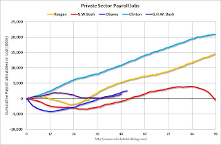
Public and Private Sector Payroll Jobs: Reagan, Bush, Clinton, Bush, Obama
Last month I posted two graphs comparing changes in public and private sector payrolls during the Bush and Obama presidencies. Several readers asked if I could add Presidents Reagan and Clinton (I've also added the single term of President George H.W. Bush).
Important: There are many differences between these periods. Overall employment was smaller in the '80s, so a better comparison might be to look at the percentage change, but this gives an overall view of employment changes.
The first graph shows the change in private sector payroll jobs from when each president took office until the end of their term(s). President George H.W. Bush only served one term, and President Obama has just started his second term.
Mr. G.W. Bush (red) took office following the bursting of the stock market bubble, and left during the bursting of the housing bubble. Mr Obama (blue) took office during the financial crisis and great recession. There was also a significant recession in the early '80s right after Mr. Reagan (yellow) took office.
There was a recession towards the end of President G.H.W. Bush (purple) term, and Mr Clinton (light blue) served for eight years without a recession.
 Click on graph for larger image.
The employment recovery during Mr. G.W. Bush's first term was very sluggish, and private employment was down 946,000 jobs at the end of his first term. At the end of Mr. Bush's second term, private employment was collapsing, and there were net 665,000 private sector jobs lost during Mr. Bush's two terms.
Private sector employment increased slightly under President G.H.W. Bush, with 1,490,000 private sector jobs added.
Private sector employment increased by 20,864,000 under President Clinton and 14,688,000 under President Reagan.
There were only 1,933,000 more private sector jobs at the end of Mr. Obama's first term. A few months into Mr. Obama's second term, there are now 2,582,000 more private sector jobs than when he took office.
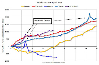 A big difference between the presidencies has been public sector employment. Note the bumps in public sector employment due to the decennial Census in 1990, 2000, and 2010.
The public sector grew during Mr. Reagan's terms (up 1,414,000), during Mr. G.H.W. Bush's term (up 1,127,000), during Mr. Clinton's terms (up 1,934,000), and during Mr. G.W. Bush's terms (up 1,748,000 jobs).
However the public sector has declined significantly since Mr. Obama took office (down 739,000 jobs). These job losses have mostly been at the state and local level, but they are still a significant drag on overall employment.
Looking forward, I expect the economy to continue to expand for the next few years, so I don't expect a sharp decline in employment as happened at the end of Mr. Bush's 2nd term (In 2005 and 2006 I was warning of a coming recession due to the bursting of the housing bubble).
A big question is when the public sector layoffs will end. It appears the cutbacks are mostly over at the state and local levels, but there are ongoing cutbacks at the Federal level.
Important: There are many differences between these periods. Overall employment was smaller in the '80s, so a better comparison might be to look at the percentage change, but this gives an overall view of employment changes.
The first graph shows the change in private sector payroll jobs from when each president took office until the end of their term(s). President George H.W. Bush only served one term, and President Obama has just started his second term.
Mr. G.W. Bush (red) took office following the bursting of the stock market bubble, and left during the bursting of the housing bubble. Mr Obama (blue) took office during the financial crisis and great recession. There was also a significant recession in the early '80s right after Mr. Reagan (yellow) took office.
There was a recession towards the end of President G.H.W. Bush (purple) term, and Mr Clinton (light blue) served for eight years without a recession.
 Click on graph for larger image.
The employment recovery during Mr. G.W. Bush's first term was very sluggish, and private employment was down 946,000 jobs at the end of his first term. At the end of Mr. Bush's second term, private employment was collapsing, and there were net 665,000 private sector jobs lost during Mr. Bush's two terms.
Private sector employment increased slightly under President G.H.W. Bush, with 1,490,000 private sector jobs added.
Private sector employment increased by 20,864,000 under President Clinton and 14,688,000 under President Reagan.
There were only 1,933,000 more private sector jobs at the end of Mr. Obama's first term. A few months into Mr. Obama's second term, there are now 2,582,000 more private sector jobs than when he took office.
 A big difference between the presidencies has been public sector employment. Note the bumps in public sector employment due to the decennial Census in 1990, 2000, and 2010.
 The public sector grew during Mr. Reagan's terms (up 1,414,000), during Mr. G.H.W. Bush's term (up 1,127,000), during Mr. Clinton's terms (up 1,934,000), and during Mr. G.W. Bush's terms (up 1,748,000 jobs).
However the public sector has declined significantly since Mr. Obama took office (down 739,000 jobs). These job losses have mostly been at the state and local level, but they are still a significant drag on overall employment.
Looking forward, I expect the economy to continue to expand for the next few years, so I don't expect a sharp decline in employment as happened at the end of Mr. Bush's 2nd term (In 2005 and 2006 I was warning of a coming recession due to the bursting of the housing bubble).
A big question is when the public sector layoffs will end. It appears the cutbacks are mostly over at the state and local levels, but there are ongoing cutbacks at the Federal level.
Modifying Products to Meet the Needs of Consumers in the Global Marketplace

Read the entire article that I wrote for MasterCard Business Network Blog: Going Global: Adapting Your Products to Meet the Needs of the Marketplace
Photo courtesy: ©2013 Laurel Delaney. All rights reserved. "Chicago Treats da Sport Mix" (Note: If a consumer overseas cannot read English, a photo on the label shows what is in the can.)
Sunday, May 26, 2013
Gasoline Prices: Down slightly from last year on Memorial Day
According to Gasbuddy.com (see graph at bottom), gasoline prices are down slightly over the last few days to a national average of $3.66 per gallon. One year ago for the week of Memorial Day, prices were at $3.67 per gallon, and for the same week two years ago prices were $3.85 per gallon.
According to Bloomberg, WTI oil is at $94.15 per barrel, and Brent is at $102.64 per barrel. Last year on Memorial Day, Brent was at $107.86 per barrel, and two years ago Brent was at $114.85.
Using the calculator from Professor Hamilton, and the current price of Brent crude oil, the national average should be around $3.40 per gallon. That is about 26 cents below the current level according to Gasbuddy.com, however I think there is a seasonal factor that isn't included in the calculator.
Note: If you click on "show crude oil prices", the graph displays oil prices for WTI, not Brent; gasoline prices in most of the U.S. are impacted more by Brent prices.
| Memorial Day | Weekly Average Gasoline Price |
|---|---|
| 28-May-07 | $3.25 |
| 26-May-08 | $3.99 |
| 25-May-09 | $2.57 |
| 31-May-10 | $2.78 |
| 30-May-11 | $3.85 |
| 28-May-12 | $3.67 |
| 27-May-13 | $3.66 |
According to Bloomberg, WTI oil is at $94.15 per barrel, and Brent is at $102.64 per barrel. Last year on Memorial Day, Brent was at $107.86 per barrel, and two years ago Brent was at $114.85.
Using the calculator from Professor Hamilton, and the current price of Brent crude oil, the national average should be around $3.40 per gallon. That is about 26 cents below the current level according to Gasbuddy.com, however I think there is a seasonal factor that isn't included in the calculator.
Note: If you click on "show crude oil prices", the graph displays oil prices for WTI, not Brent; gasoline prices in most of the U.S. are impacted more by Brent prices.
| Orange County Historical Gas Price Charts Provided by GasBuddy.com |
States: Mo Money Mo Problems
From the NY Times: California Faces a New Quandary, Too Much Money
1) At the least, this means that the fiscal drag at the state and local levels is mostly over. This graph shows the contribution to percent change in GDP for residential investment and state and local governments since 2005.
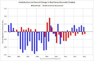 Click on graph for larger image.
The blue bars are for residential investment (RI), and RI was a significant drag on GDP for several years. Now RI has added to GDP growth for the last 8 quarters (through Q1 2013).
However the drag from state and local governments has continued. The drag from state and local governments has been a relentless drag on the economy. Just ending this drag will be a positive for the economy. Note: In real terms, state and local government spending is back to early 2001 levels.
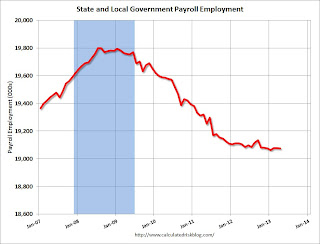 This graph shows total state and government payroll employment since January 2007. State and local governments lost jobs for four straight years. (Note: Scale doesn't start at zero to better show the change.)
State and local employment is unchanged so far in 2013.
Of course the Federal government layoffs are ongoing with many more layoffs expected due to the sequestration spending cuts.
2) The article notes three possibilities for the small surpluses: "restore programs cut during the recession, finance tax cuts or put into a rainy-day fund". With the surpluses just starting, I think tax cuts should be off the table (they are too hard to reverse if revenue falters). My suggestion would be to pay down debt (rainy-day fund) and cautiously restore some cuts.
3) Last November, I was interviewed by Joe Weisenthal at Business Insider. One of my comments during our discussion on state and local governments was:
After years of grueling battles over state budget deficits and spending cuts, California has a new challenge on its hand: too much money. An unexpected surplus is fueling an argument over how the state should respond to its turn of good fortune.A few comments:
The amount is a matter of debate, but by any measure significant: between $1.2 billion, projected by Gov. Jerry Brown, and $4.4 billion, the estimate of the Legislature’s independent financial analyst.
...
At least seven other states — among them Connecticut, Utah and Wisconsin — have reported budget surpluses in recent weeks, setting the stage for legislative battles that, if not as wrenching as the ones over cuts, promise to be no less pitched. Lawmakers are debating whether the new money should be used to restore programs cut during the recession, finance tax cuts or put into a rainy-day fund for future needs.
1) At the least, this means that the fiscal drag at the state and local levels is mostly over. This graph shows the contribution to percent change in GDP for residential investment and state and local governments since 2005.
 Click on graph for larger image.
The blue bars are for residential investment (RI), and RI was a significant drag on GDP for several years. Now RI has added to GDP growth for the last 8 quarters (through Q1 2013).
However the drag from state and local governments has continued. The drag from state and local governments has been a relentless drag on the economy. Just ending this drag will be a positive for the economy. Note: In real terms, state and local government spending is back to early 2001 levels.
 This graph shows total state and government payroll employment since January 2007. State and local governments lost jobs for four straight years. (Note: Scale doesn't start at zero to better show the change.)
 State and local employment is unchanged so far in 2013.
Of course the Federal government layoffs are ongoing with many more layoffs expected due to the sequestration spending cuts.
2) The article notes three possibilities for the small surpluses: "restore programs cut during the recession, finance tax cuts or put into a rainy-day fund". With the surpluses just starting, I think tax cuts should be off the table (they are too hard to reverse if revenue falters). My suggestion would be to pay down debt (rainy-day fund) and cautiously restore some cuts.
3) Last November, I was interviewed by Joe Weisenthal at Business Insider. One of my comments during our discussion on state and local governments was:
I wouldn’t be surprised if we see all of a sudden a report come out, “Hey, we’ve got a balanced budget in California.”Nice to see it is happening in other states too.
Saturday, May 25, 2013
How to Calculate Q2 Personal Consumption Expenditure (PCE) Growth
In the schedule for the coming week, I mentioned that the consensus is for personal consumption expenditures (PCE) to be unchanged in April compared to March. Does this mean PCE might not grow in Q2?
First, we don't know the actual number for April yet - and we don't know about May and June - but even if PCE were flat for all three months compared to March, quarterly PCE would grow 1.3% in Q2. This is because quarterly PCE is calculated as an average of the current quarter divided by the average for the previous quarter (seasonally adjusted and annualized).
The following table shows how this works. For Q4 2012, PCE averaged $9,663.8 SAAR (Seasonally Adjusted Annual Rate, billions, 2005 dollars). For Q1 2013, PCE averaged $9,740.0.
If we divided $9,740.0 by $9,663.8 we get 1.007885. Then annualize (take to the fourth power) and subtract 1, and the growth rate is 3.2% (just what the BEA reported for PCE growth in Q1).
If we do the same calculation for Q2, even if PCE is flat for all three months in Q2 (April, May and June), PCE will grow by 1.3% in Q2.
If instead we just compare April to January, PCE would be growing at a 2.6% annual rate in Q2. This is one of the reasons several analysts have recently upgraded their forecasts for Q2 GDP. It appears likely that PCE growth will be above 2% in Q2. Of course government spending - especially Federal government spending - will probably remain a drag on GDP in Q2 (there has been record shrinkage of the public sector over the last several years).
The following graph shows real Personal Consumption Expenditures (PCE) through March (2005 dollars). Note that the y-axis doesn't start at zero to better show the change.
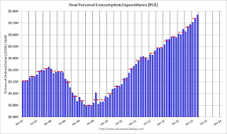 Click on graph for larger image.
This graph shows real PCE by month for the last few years. The dashed red lines are the quarterly levels for real PCE.
Since PCE grew at just under a 4% annualized rate in February and March (and quarterly PCE is an average for the quarter), if PCE is flat in April, May and June, PCE already has some growth built in for Q2 compared to Q1.
First, we don't know the actual number for April yet - and we don't know about May and June - but even if PCE were flat for all three months compared to March, quarterly PCE would grow 1.3% in Q2. This is because quarterly PCE is calculated as an average of the current quarter divided by the average for the previous quarter (seasonally adjusted and annualized).
The following table shows how this works. For Q4 2012, PCE averaged $9,663.8 SAAR (Seasonally Adjusted Annual Rate, billions, 2005 dollars). For Q1 2013, PCE averaged $9,740.0.
If we divided $9,740.0 by $9,663.8 we get 1.007885. Then annualize (take to the fourth power) and subtract 1, and the growth rate is 3.2% (just what the BEA reported for PCE growth in Q1).
If we do the same calculation for Q2, even if PCE is flat for all three months in Q2 (April, May and June), PCE will grow by 1.3% in Q2.
| Q2 Personal Consumption Expenditure (PCE) Growth | ||||
|---|---|---|---|---|
| Quarter | Month | Real PCE, SAAR 2005 dollars (Billions) | Qtr Average | Qtr Growth Rate |
| Oct-12 | $9,629.5 | |||
| Q4 | Nov-12 | $9,673.0 | $9,663.8 | |
| Dec-12 | $9,689.0 | |||
| Jan-13 | $9,708.7 | |||
| Q1 | Feb-13 | $9,740.3 | $9,740.0 | 3.2% |
| Mar-13 | $9,771.1 | |||
| Apr-13 | $9,771.11 | |||
| Q2 | May-13 | $9,771.1 | 1.3% | |
| Jun-13 | ||||
| 1Consensus forecast for April 2013 | ||||
If instead we just compare April to January, PCE would be growing at a 2.6% annual rate in Q2. This is one of the reasons several analysts have recently upgraded their forecasts for Q2 GDP. It appears likely that PCE growth will be above 2% in Q2. Of course government spending - especially Federal government spending - will probably remain a drag on GDP in Q2 (there has been record shrinkage of the public sector over the last several years).
The following graph shows real Personal Consumption Expenditures (PCE) through March (2005 dollars). Note that the y-axis doesn't start at zero to better show the change.
 Click on graph for larger image.
This graph shows real PCE by month for the last few years. The dashed red lines are the quarterly levels for real PCE.
Since PCE grew at just under a 4% annualized rate in February and March (and quarterly PCE is an average for the quarter), if PCE is flat in April, May and June, PCE already has some growth built in for Q2 compared to Q1.
Subscribe to:
Posts (Atom)